
Forest Altar
Hello everybody, I just finished up this painting this week and thought I'd put up some images and talk a little bit about my thought process through some of it.
Forest Altar - 2014
9x12"
Ink and Watercolor
So if you've been keeping up with my work for the past few months -thanks if you have, by the way- then you might notice a very striking similarity to the late, great illustrator Jean Giraud aka Moebius. This is not by accident, I mean he's a figurehead in comics and illustration with good reason. It's not only his style though, that I'm attracted to, I love his line making and atmosphere but the narrative he's able to convey. The stories in his works are mystical, detailed worlds that I am always dying to know more about. That's really what I want to strive towards. The idea of 'world-building' has always been extremely appealing to me and has been something I've always done.
In this image I wanted the sense of discovery to come across, that the traveler- who is at this point anonymous- has come upon massive statue in the middle of what I hoped would be a very dense jungle. This composition is actually very similar to a recent Killian Eng piece, but art being what it is, I took what I liked and added what I wanted to be there. I have an immense respect for his work and what he's doing and he's another that was massively influenced by Moebius, but has put his own spin on that type of work. I'd very much like to do what he's doing right now.
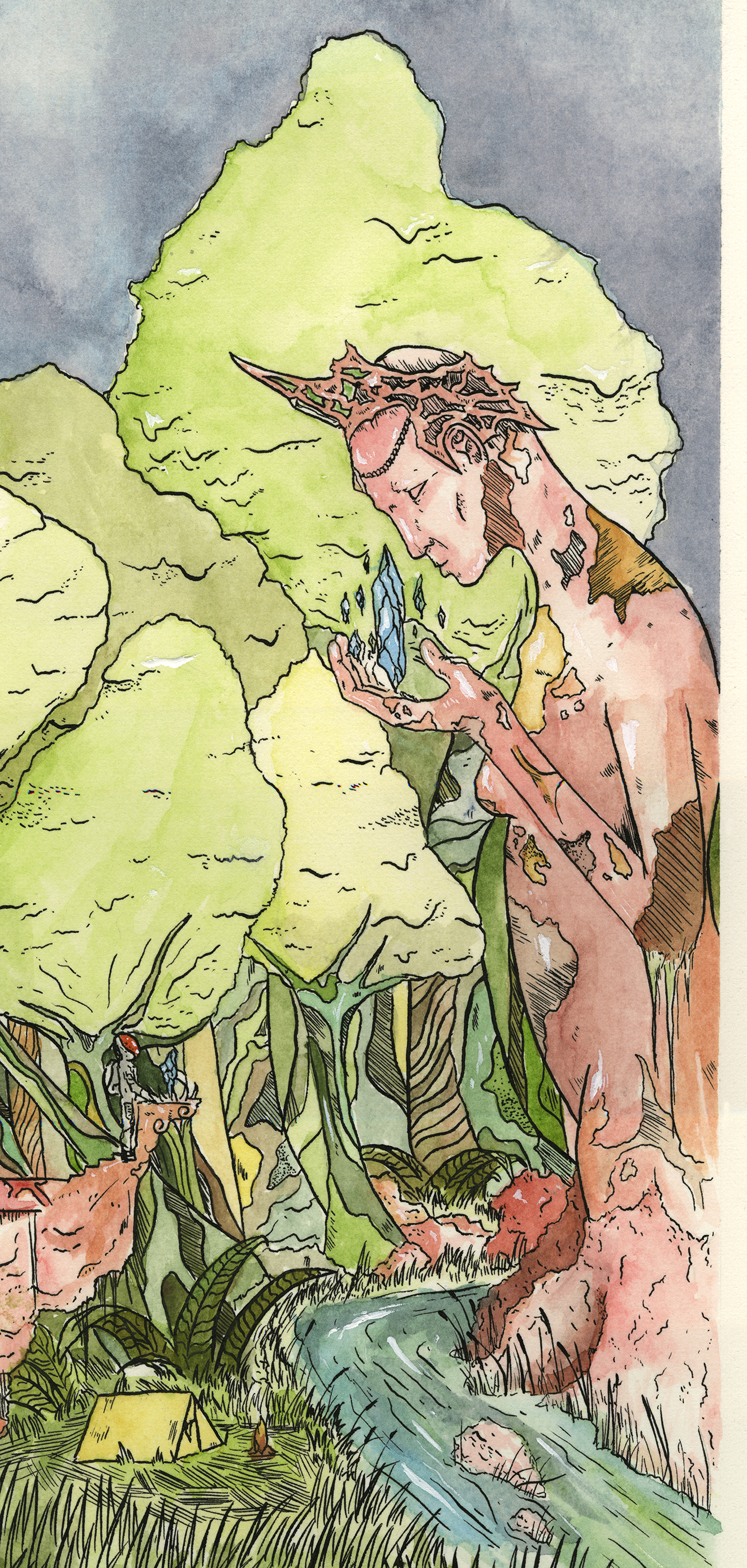
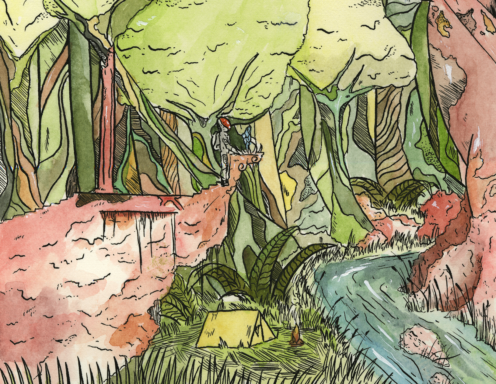
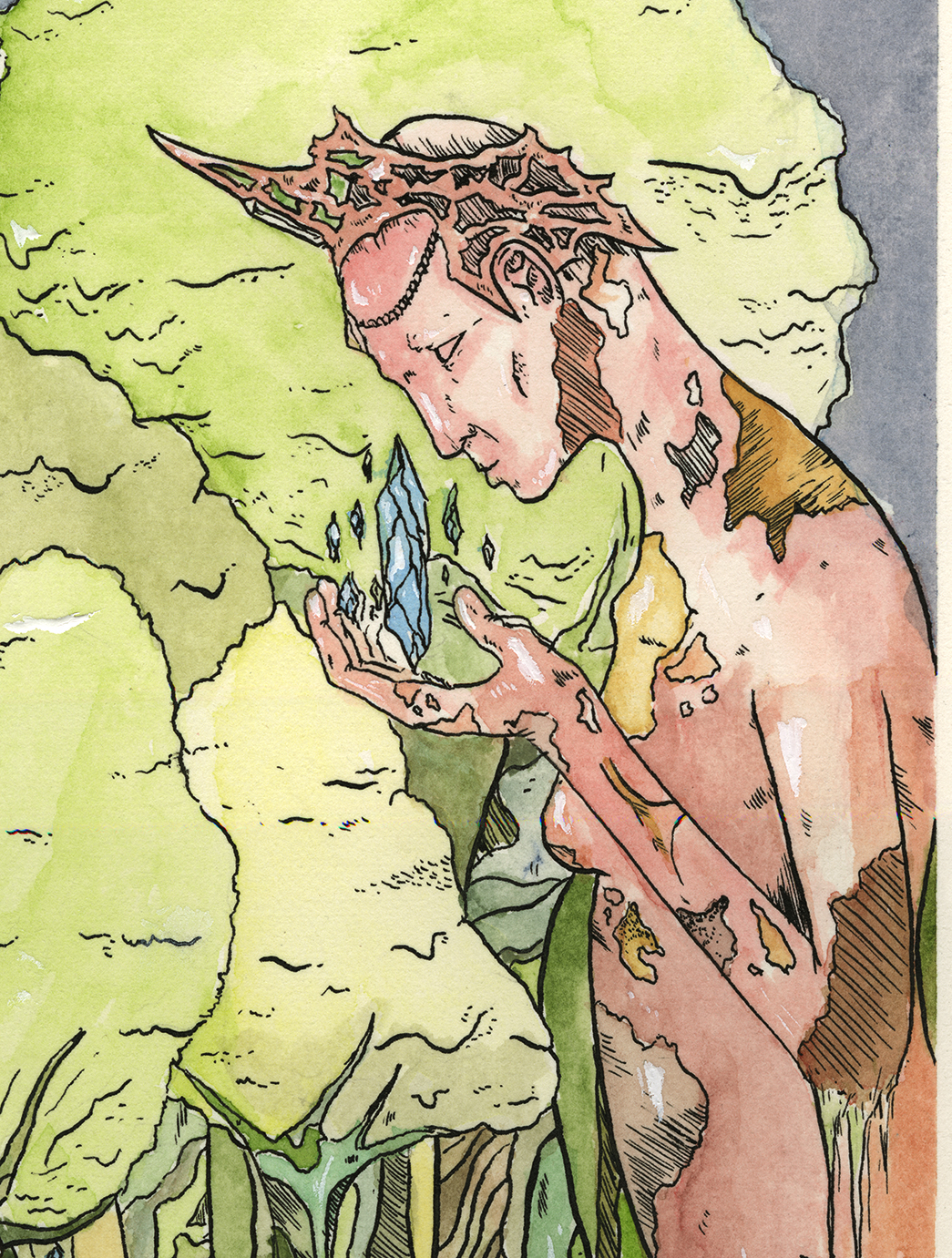
There are some close ups here so you get get a little better idea of what's going on. I actually scanned it in at 1200dpi on the amazing Epson 10000xl we have in the office which I think offers a really good reproduction on a screen as you're likely to get. I boosted the levels in Photoshop slightly, but really there wasn't any need for post-production on this one. I ended up being really happy with how things came out for the most part. I've been doing a lot of 'campsite' pieces lately, where my explorer is very obviously out in the world, well exploring. I haven't figured out what role the Crystals will play in my little fiction but, their mystery is part of the appeal for me. The idea of this mystical, powerful force existing in a futuristic science fiction world is extremely interesting to me. I'm not sure if that's the case for anyone else, but I feel successful in this one.


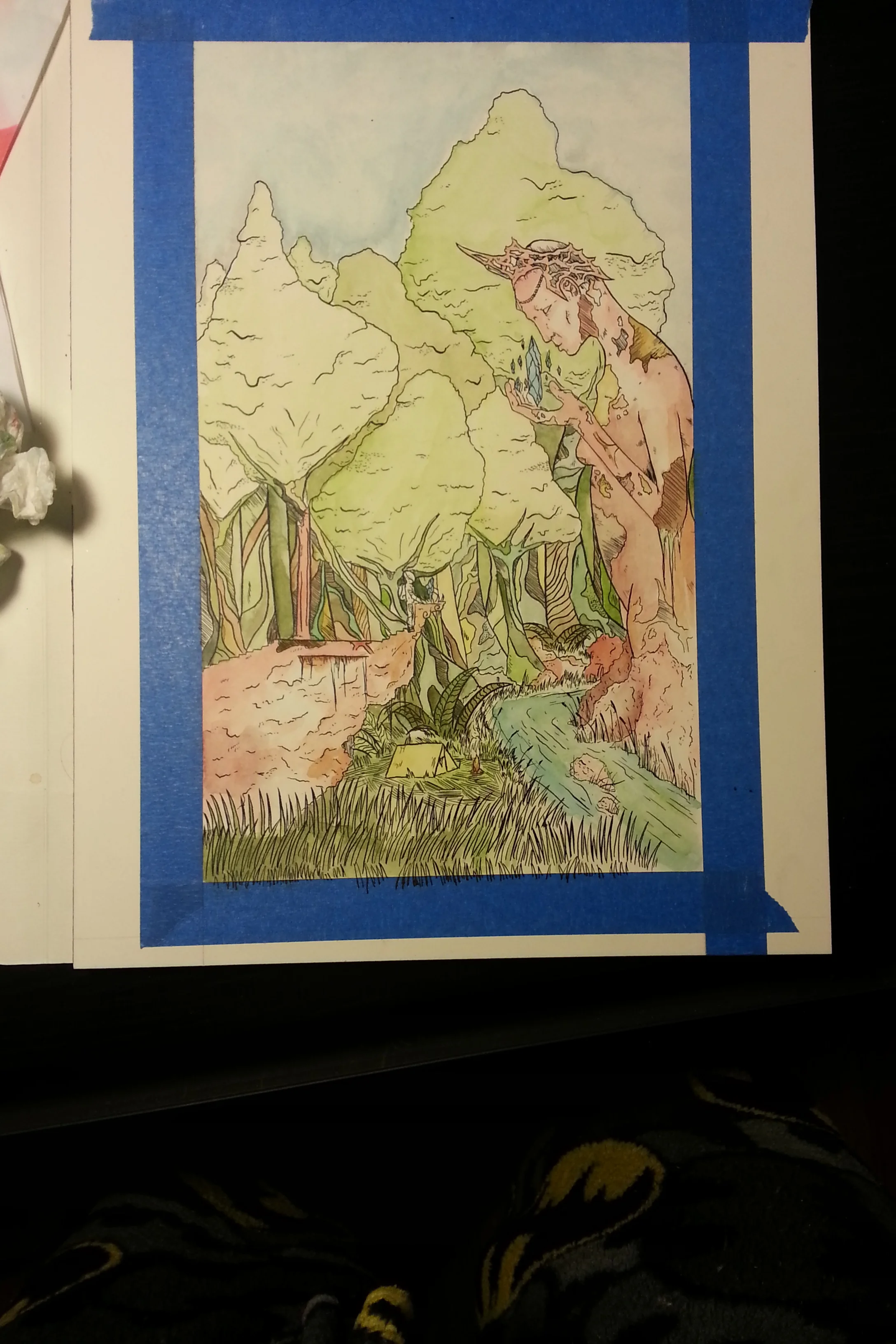


Above are some process shots of the making of this thing. I recently converted my inking/painting surface to a Fabriano Hot Press Watercolor block, which was a real turning point for me. The problems I had with buckling, smearing etc were gone and I could really focus on what I wanted to make instead of working around the technical limitations of the media. The lines are vector-crisp and the paint is brilliant and clear. The only problem I've faced is how quickly it dries for flat washes (you can really see that in the sky) but I'm getting better I think.
Feel free to share my stuff on your chosen social platform, but please do me a favor and link back to this site or use my name.

New works (in progress) for December
Hello all!
I've been busting my butt making new stuff so I thought I'd put some stuff up here and talk about how things have been going kind of wrong.
Red Fox in Snow - 2013
9x12"
Ink and Watercolor
detail (sorry for the watermark :/)
There are some problems going on with this guy, and it's definitely not the last stab I plan on taking at the red fox. I like using really diluted ink as a wash for snow ( I love red foxes in snow) and I think his washes are ok for his coat. The face is pretty rough and he has somehow grown two rear left feet. Weird. I'm not being self deprecating for no reason here though, I think it's a really good way avoid repeating stupid mistakes. Practice.
Popular culture aside, I really enjoy everything about foxes-the mythology, their mannerisms, and obviously the way they look. When I lived in West Virginia all of the foxes must have been exponentially more cunning than the ones in Maryland because I have seen at least 6 in the two years I've lived here. That's been really interesting to me lately though-seeing animals in parking lots and driveways that previously I'd only ever seen from a distance. I've seen a 10 point buck in my metro lot 3 times just hanging out. He doesn't have a thing in the world to worry about compared to his WV cousin.
Crystal Discovery - 2013
4x6"
Ink and watercolor
I've been thinking about the intersection of logic in crystals and fungi lately. More on that later. This is a really quick little thing I did all in one day. To be honest it was mostly practice, so it's pretty rough around the edges as well, but over all I like the idea and composition.
Odd Deposit - 2013
9x12"
Ink and failure
I worked on this guy for maybe 10 hours altogether and I bet the very first thing you notice is that weird and lumpy circle above the mountains. Life is full of lessons and the one I learned that day is this: if you're going to a bunch of time on something, do the most complicated part first. How many times have I drawn a perfect circle in ink? No times. Zero amount of times. Why then would I wait until I was done with this entire piece to try and freehand that sun? The good part about the situation is that it scanned in really cleanly and I think I can color it digitally and take that sun out. It's a real shame though, I wanted to paint it.
Dark Djinn - 2013
9x12"
Ink, coffee, failure
ugh the bleed, THE BLEED
The last one here is similar to the one before it in that I messed things up right at the end, though I didn't spend nearly as much time working on it. 2 big things happened on this one I spilled coffee on it, and used the wrong type of pen. The coffee thing isn't a huge deal, I just scanned it in and can paint it digitally, but apparently the pen I was using had a different type of ink that did not agree with the paper. The unfortunate thing about it is you can't see the bleeding until it's too late. The only parts affected were really small details but it still bothered me. Ah well, live and learn. That's kind of what this whole post is about I guess: learning. Someone wise told me once that experience is only gained by failure and that you must not be afraid to fail. I've been gaining experience by leaps and bounds the last month or two and a lot of that experience has stemmed from doing something either entirely avoidable or just careless. All of these are works in progress or works that need to go in a different direction-though that isn't necessarily a bad thing. Sometimes changing course can be exactly what you need.
Additionally, I'm still gaining loads of experience in keeping up this site and if something goes wrong or looks weird or is broken I might not know about it. So if something weird happens when you're here, shoot me a quick email and I will extremely grateful.
Crystal Discovery no.1
I did this little 4x6 work in a day and I came away fairly satisfied with it. I've been creating this very elaborate fiction about the nature of these crystals so mainly I wanted to practice how they looked. Let me know what you think!
Crystal Discovery - 2013
4x6"
Ink and Watercolor on coldpress block

The Difference Two Months Makes: A reflection about practice
Hey folks, I logged onto my Dribbble account today to put up the genie piece that I was really proud of and much to my chagrin I saw these two images:
The idea was there, the execution was not. Click to enlarge (please don't though, it's bad)

BURN IT WITH FIRE
You can click on them if you really want to. The thing is I had an idea that I really liked, but I had only very recently tried to get into this kind of line work and had really never tried digital coloring at all. I posted both of them to dribbble.com and kind of forgot about them. The reception was tepid at best and I left that idea behind, a failure. I revisited this particular idea partially on a whim and partially because my friend Leigh Ann had really liked it and I wanted to improve on something. The lines are ok on the scanned in one, but not very strong at all. There's some sense of volume, but it's weak and all over the place. What bothered me the most were the sloppy lines that made things look just slightly off and made everything look weird to me. The color is bad and over saturated in the digital version and I didn't bring the original in large enough to get rid of some of the fuzziness from the low res scan.

Here's the version I re-did last week. Now, it isn't perfect, believe me, but it's an improvement. For this one I used the wrong kind of pen for the type of paper I used and I thought I was completely boned, but kept going. I figured I could see it out to the finish to see if I could correct what I did wrong last time. The end result looks pretty decent at this resolution, but can't get much larger without seeing the MAJOR imperfections in the lines and colors.
The reason I'm doing this post though, is not to point out all the little flaws and imperfections in my but to illustrate that with daily, purposeful practice improvements can be seen. I've been seriously busting my butt trying to get better with my line consistency, my forms, and a hundred other things- but in a vacuum, it seems all for naught.
It's hard to see where you're improving and growing with your face so close to the page so-to-speak. So like the last iteration, I put this on the internet in a major way to see what would happen. This one drove much more traffic to my site, got positive comments on Reddit, and doubled my pageviews on my site. Now, that doesn't mean anything in the grand scheme of things, but to me, personally, it's huge. People were coming to my site and seeing my content. People were commenting positively and providing real feedback. I wouldn't call this piece perfect, not by a long shot, but I decided to do it anyway. I was so discouraged by the reception of the last iteration that I almost didn't put it up, and just could have just kept tweaking the lines and colors for weeks. In the end though, I decided to call a spade a spade and put it up. Sure I could keep working on it, but I'm a chronic overworker and I knew I needed to let it go to move on to something more productive. That's not something I would have done 2 or 3 months ago for sure, but now I know that's a pitfall to avoid.
I might be meandering a bit here, but the point is this-art is a practice. In yoga, there is no 'winning'- just practice. You deliberately do your poses - even if they aren't perfect, and reflect when you're done on what you can do to improve and take that with you when you're done. I see drawing and art in general the same way. There isn't any 'winning', when you can quit and stop forever as the victor. You sacrifice, practice deliberately, and when it's done you put it away and move on. I've learned so many things from this project that I can take with me on to the next one-which is worth more than any amount of likes, or upvotes, or pageviews.

The Genie Experiment
So, in my newly found quest to become an illustrator, it quickly became clear that I was missing a very cool and mysterious toolset- the digitally colored, scanned-in, ink drawing. This whole thing was ,and still is very curious to me, because I've tried it several times, and each time, I've been bummed out by the results. The lines were fuzzy, and I could never quite get the process right, because mine looked like poop. So this week I decided to really dedicate 100% to something I wasn't very good at to...well get good at it- or better at least.
If you want to see the full res versions of the scan and colored artwork, you can look at them here.
So what I started with was a drawing I did pretty casually at work and in bed over a couple of days. I didn't hate it, and I've been interested in fleshing out something like it for a while.
So when I was happy with the pencil version, I taped it to some board and taped some Canson Graphics 360 paper over top of it. This, in hindsight, was a bad idea because the graphics paper, while amazing for markering, was terrible for rapidograph pens. Live and learn I suppose.
Unfortunately my stubbornness knows no bounds, so instead of being reasonable and switching to felt-tip pens, I stuck it out to the end with the rapidographs. The problem with these is that they just don't work with the paper as well, and bleed ever so slightly in weird ways, which you can see if you scan it at 1200dpi like I did. Bristol, this is not.
Here you can see the final scan. There's a really awesome crease there in the corner I made while being really careless in the studio. Life lessons abound in this project! I scanned it in at 1200dpi to try and get as much information as possible to start with.
Final coloring without a background. Click to enlarge.
After a lot of tutorials and starting over several times I finally got to the place where I could start actually coloring. The process from there was extremely simple-just picking my palette and carefully, tediously filling everything in. I wanted the color to add some volume and character without detracting from the lines I had made. I'm not sure how successful that was, but I enjoy the colored version more than just the lined one.
This is the kind of sort of final coloring of this guy. I didn't want to overwork things like I usually do, so I drew a stopping point and just stopped. I thew the purple in the background because I'm so used to just drawing characters floating in white space, and that just isn't that visually interesting for most people. I drew a lot of inspiration from Native American (specifically pacific northwest tribes) and ancient Egyptian jewelry for the genie's ornamentation. I really like the idea that a genie's power is derived from these symbol-laden, jewel encrusted, enormous jewelry pieces. At any rate, I have had a lot of advice to post my process on my site, and in doing so I really have been able to reflect on what I liked and disliked about this project. In the future I will definitely get sharper lines initially to avoid all my fuzzy scan in problems. I hope you enjoyed reading, or at least looking the funny drawings.