


Gooey Sentinel Updated
Here's the final version of my 'Gooey Sentinel' (I'm terrible at names) that I made available for printing over at Society 6 and on my site.


Here are some mock-ups for what it looks like printed in a few different ways.


Here's the final progression .gif I made for the various stages of this project. I'd say it was successful for me technique-wise, but the reception from everywhere online has been lukewarm to say the least. I've been posting the stuff I'm making everywhere that I'm a part of and just can't seem to connect with any more than a couple people at a time.
I don't even know if anyone is even reading this right now. It doesn't matter either way. I'm just going to keep doing it - for myself more than anyone. I know if I keep making stuff and putting it up to share, and talking to other artists something will happen eventually- it's the time in between that's always the hardest with things.


New works (in progress) for December
Hello all!
I've been busting my butt making new stuff so I thought I'd put some stuff up here and talk about how things have been going kind of wrong.
Red Fox in Snow - 2013
9x12"
Ink and Watercolor
detail (sorry for the watermark :/)
There are some problems going on with this guy, and it's definitely not the last stab I plan on taking at the red fox. I like using really diluted ink as a wash for snow ( I love red foxes in snow) and I think his washes are ok for his coat. The face is pretty rough and he has somehow grown two rear left feet. Weird. I'm not being self deprecating for no reason here though, I think it's a really good way avoid repeating stupid mistakes. Practice.
Popular culture aside, I really enjoy everything about foxes-the mythology, their mannerisms, and obviously the way they look. When I lived in West Virginia all of the foxes must have been exponentially more cunning than the ones in Maryland because I have seen at least 6 in the two years I've lived here. That's been really interesting to me lately though-seeing animals in parking lots and driveways that previously I'd only ever seen from a distance. I've seen a 10 point buck in my metro lot 3 times just hanging out. He doesn't have a thing in the world to worry about compared to his WV cousin.
Crystal Discovery - 2013
4x6"
Ink and watercolor
I've been thinking about the intersection of logic in crystals and fungi lately. More on that later. This is a really quick little thing I did all in one day. To be honest it was mostly practice, so it's pretty rough around the edges as well, but over all I like the idea and composition.
Odd Deposit - 2013
9x12"
Ink and failure
I worked on this guy for maybe 10 hours altogether and I bet the very first thing you notice is that weird and lumpy circle above the mountains. Life is full of lessons and the one I learned that day is this: if you're going to a bunch of time on something, do the most complicated part first. How many times have I drawn a perfect circle in ink? No times. Zero amount of times. Why then would I wait until I was done with this entire piece to try and freehand that sun? The good part about the situation is that it scanned in really cleanly and I think I can color it digitally and take that sun out. It's a real shame though, I wanted to paint it.
Dark Djinn - 2013
9x12"
Ink, coffee, failure
ugh the bleed, THE BLEED
The last one here is similar to the one before it in that I messed things up right at the end, though I didn't spend nearly as much time working on it. 2 big things happened on this one I spilled coffee on it, and used the wrong type of pen. The coffee thing isn't a huge deal, I just scanned it in and can paint it digitally, but apparently the pen I was using had a different type of ink that did not agree with the paper. The unfortunate thing about it is you can't see the bleeding until it's too late. The only parts affected were really small details but it still bothered me. Ah well, live and learn. That's kind of what this whole post is about I guess: learning. Someone wise told me once that experience is only gained by failure and that you must not be afraid to fail. I've been gaining experience by leaps and bounds the last month or two and a lot of that experience has stemmed from doing something either entirely avoidable or just careless. All of these are works in progress or works that need to go in a different direction-though that isn't necessarily a bad thing. Sometimes changing course can be exactly what you need.
Additionally, I'm still gaining loads of experience in keeping up this site and if something goes wrong or looks weird or is broken I might not know about it. So if something weird happens when you're here, shoot me a quick email and I will extremely grateful.
Crystal Discovery no.1
I did this little 4x6 work in a day and I came away fairly satisfied with it. I've been creating this very elaborate fiction about the nature of these crystals so mainly I wanted to practice how they looked. Let me know what you think!
Crystal Discovery - 2013
4x6"
Ink and Watercolor on coldpress block

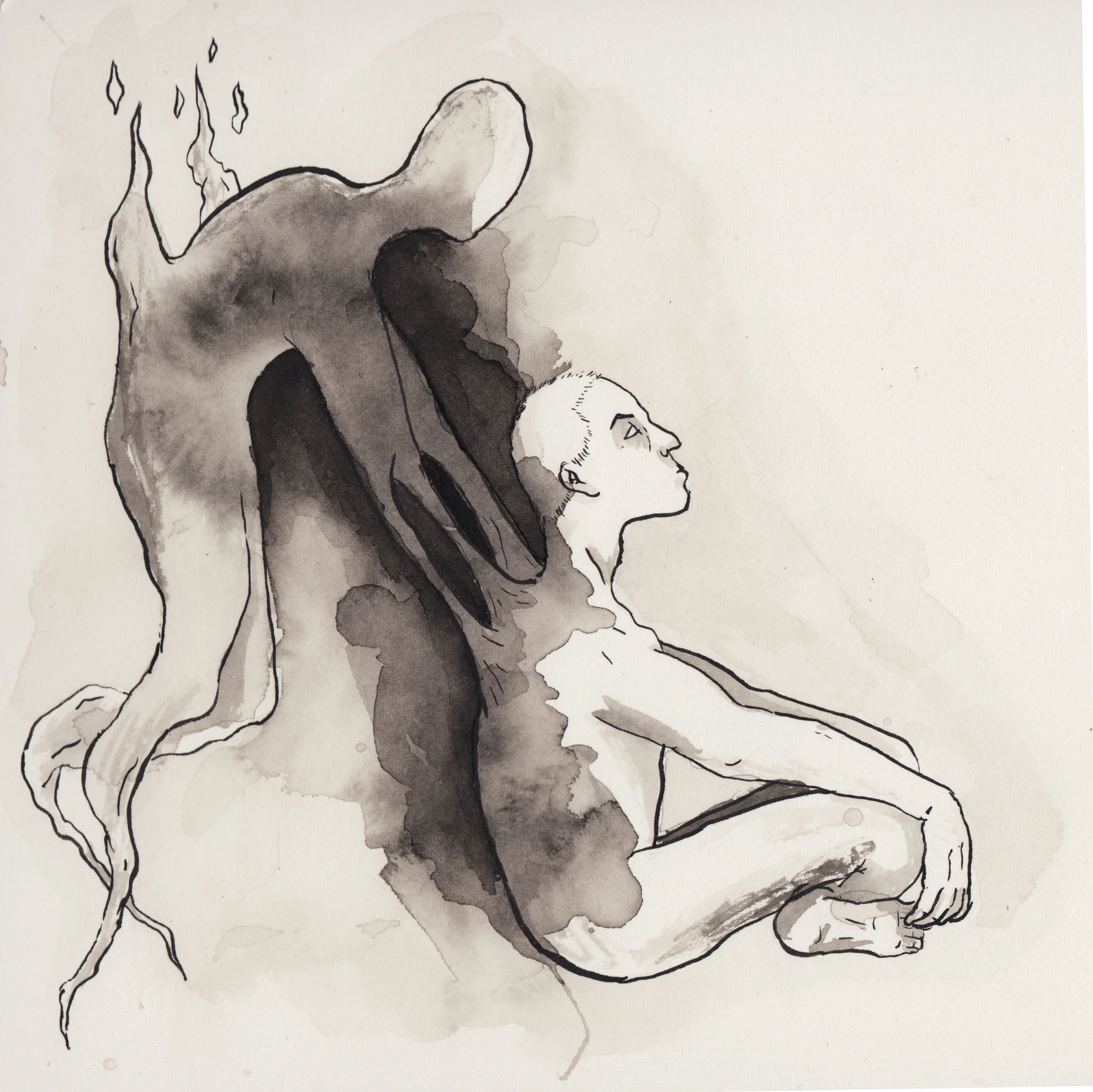
Third Eye
"Third Eye" Final Art - click to enlarge
Here's another quick foray into digital coloring. My first version of this I went through and colored everything individually and when I was done I didn't like it. I did something a teacher taught me a long time ago I'm just now starting to practice-I put it away. I didn't throw it out, or delete it, or give up-I stashed it. Later, I had an idea -debatable if it was a good one or not- to make the main emphasis the exploding glass and the opening of the third eye. I put the exact center in the pupil of the eye and colored it flat and knew I was on to something. I don't really know this way or that about the spiritual aspect of the third eye, but the idea of seeing 'beyond' to something else -placidly- and moments before death, appealing. I'd like to expand on the idea in the future, but for now, like meat right off the grill-the best thing to do is let it rest.
"Third Eye" detail - click to enlarge

The Difference Two Months Makes: A reflection about practice
Hey folks, I logged onto my Dribbble account today to put up the genie piece that I was really proud of and much to my chagrin I saw these two images:
The idea was there, the execution was not. Click to enlarge (please don't though, it's bad)

BURN IT WITH FIRE
You can click on them if you really want to. The thing is I had an idea that I really liked, but I had only very recently tried to get into this kind of line work and had really never tried digital coloring at all. I posted both of them to dribbble.com and kind of forgot about them. The reception was tepid at best and I left that idea behind, a failure. I revisited this particular idea partially on a whim and partially because my friend Leigh Ann had really liked it and I wanted to improve on something. The lines are ok on the scanned in one, but not very strong at all. There's some sense of volume, but it's weak and all over the place. What bothered me the most were the sloppy lines that made things look just slightly off and made everything look weird to me. The color is bad and over saturated in the digital version and I didn't bring the original in large enough to get rid of some of the fuzziness from the low res scan.

Here's the version I re-did last week. Now, it isn't perfect, believe me, but it's an improvement. For this one I used the wrong kind of pen for the type of paper I used and I thought I was completely boned, but kept going. I figured I could see it out to the finish to see if I could correct what I did wrong last time. The end result looks pretty decent at this resolution, but can't get much larger without seeing the MAJOR imperfections in the lines and colors.
The reason I'm doing this post though, is not to point out all the little flaws and imperfections in my but to illustrate that with daily, purposeful practice improvements can be seen. I've been seriously busting my butt trying to get better with my line consistency, my forms, and a hundred other things- but in a vacuum, it seems all for naught.
It's hard to see where you're improving and growing with your face so close to the page so-to-speak. So like the last iteration, I put this on the internet in a major way to see what would happen. This one drove much more traffic to my site, got positive comments on Reddit, and doubled my pageviews on my site. Now, that doesn't mean anything in the grand scheme of things, but to me, personally, it's huge. People were coming to my site and seeing my content. People were commenting positively and providing real feedback. I wouldn't call this piece perfect, not by a long shot, but I decided to do it anyway. I was so discouraged by the reception of the last iteration that I almost didn't put it up, and just could have just kept tweaking the lines and colors for weeks. In the end though, I decided to call a spade a spade and put it up. Sure I could keep working on it, but I'm a chronic overworker and I knew I needed to let it go to move on to something more productive. That's not something I would have done 2 or 3 months ago for sure, but now I know that's a pitfall to avoid.
I might be meandering a bit here, but the point is this-art is a practice. In yoga, there is no 'winning'- just practice. You deliberately do your poses - even if they aren't perfect, and reflect when you're done on what you can do to improve and take that with you when you're done. I see drawing and art in general the same way. There isn't any 'winning', when you can quit and stop forever as the victor. You sacrifice, practice deliberately, and when it's done you put it away and move on. I've learned so many things from this project that I can take with me on to the next one-which is worth more than any amount of likes, or upvotes, or pageviews.